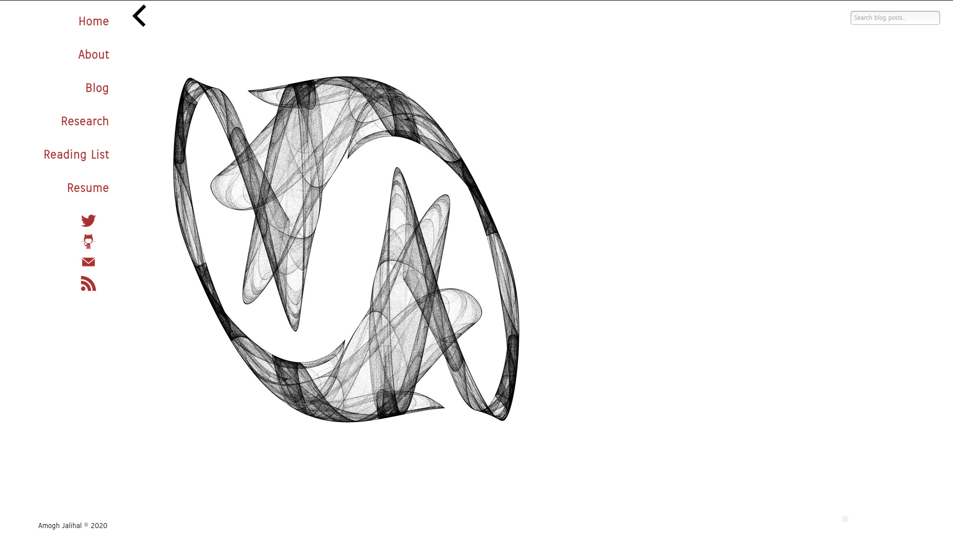
Landing page evolution of my site
I think one of the best decisions I made since starting grad school is investing the time to learn git and github, and using these tools to maintain my website. The git history of this repo is very reflective of the learning curve for git: too many changes or too few changes per commit, terrible commit messages, and tons of unnecessary files. But I am glad that I have stuck to one repo, because it has allowed me to roll back to older versions and see what they looked like. Here’s the gallery.
2016-2017
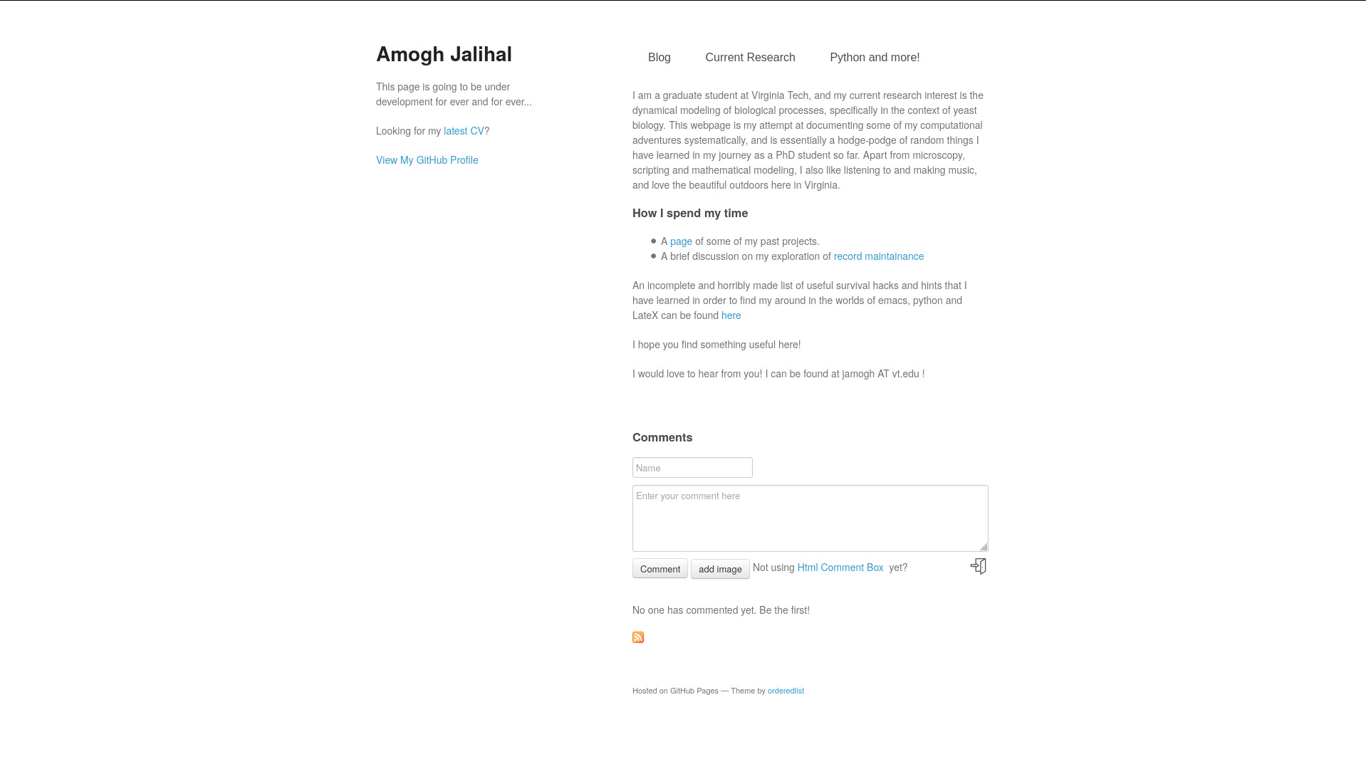
The oldest commit on the repo is from the 5th of December 2015, a plain HTML page with some ascii art of my face. But starting in November 2016, I started using the minimal mistakes theme.
2017-2019
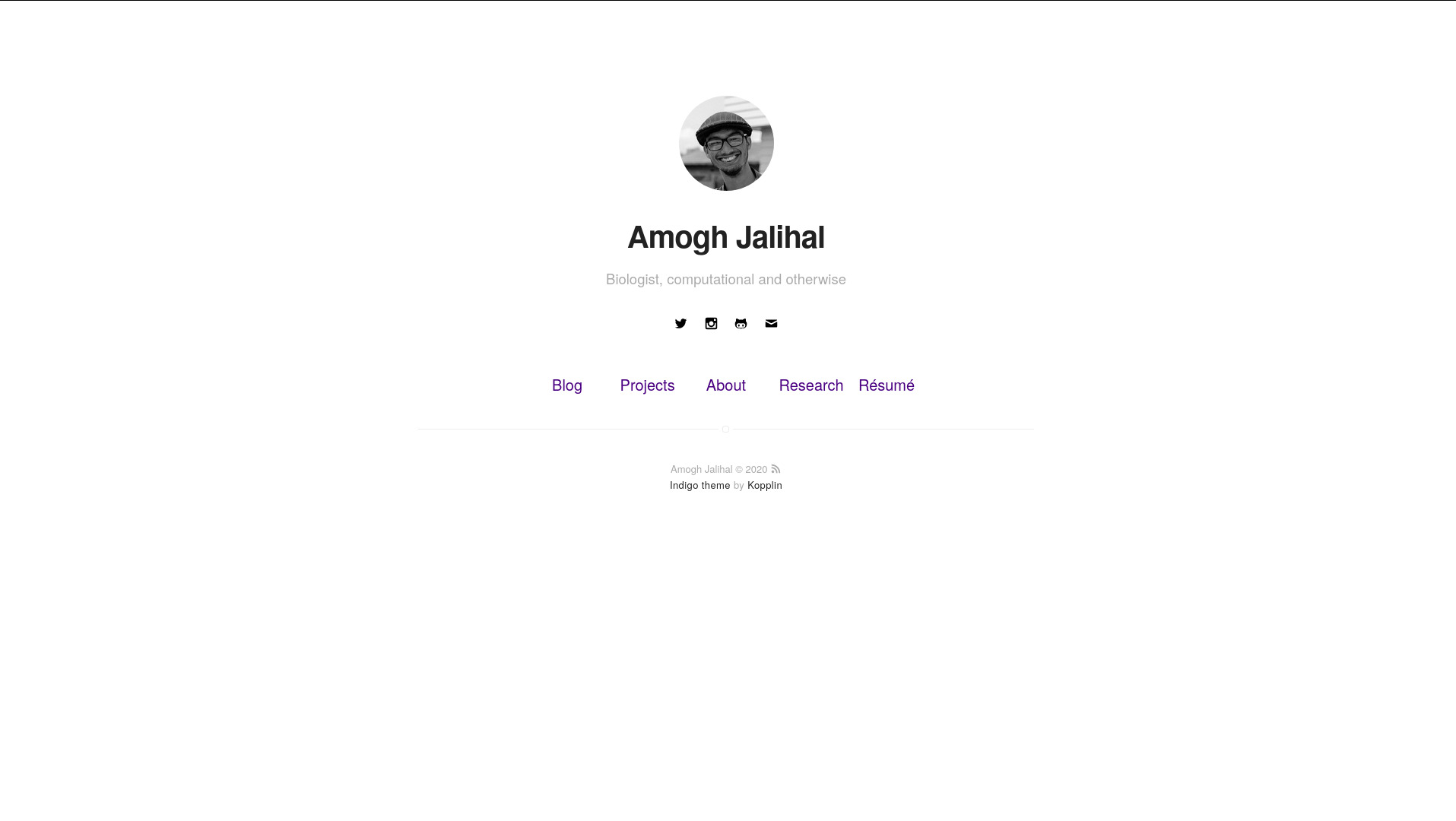
In the second year of my PhD, probably inspired by people like Daniel Chen and Mitch Wagner, I upgraded to the Indigo theme. I think I understood more of how Jekyll worked this time around. I think this is still my favorite out-of-the-box Jekyll template I’ve seen. It had these neat animations when you hovered over my face, still haven’t figured out how that works. This was around the time when I was taking the Preparing for the Future Professoriate class with Dean DePauw, and we were required to setup RSS feeds for our weekly blogs.
2019 October - November
I finally outgrew Indigo in the middle of 2019. I had been increasingly seeing blogs setup to loosely template-wrap org-mode markdown content. I liked the idea a lot, but having to migrate all my content out of Jekyll markdown to org-mode markdown was not worth my time just yet when I didn’t have a templating system that I felt comfortable with. I decided to build a template from scratch, so I started with the tutorial on the Jekyll website and modified things along the way. I don’t think it took me more than an afternoon to become familiar with the CSS/HTML interactions with the Jekyll template specifications.
2019 November - December
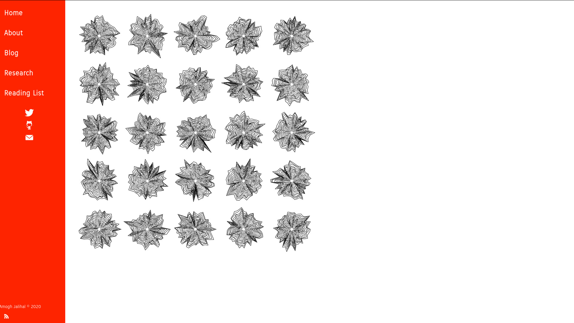
I have been steadily learning more about CSS and fine tuning my setup since the major change. For a while it was merely cosmetic.
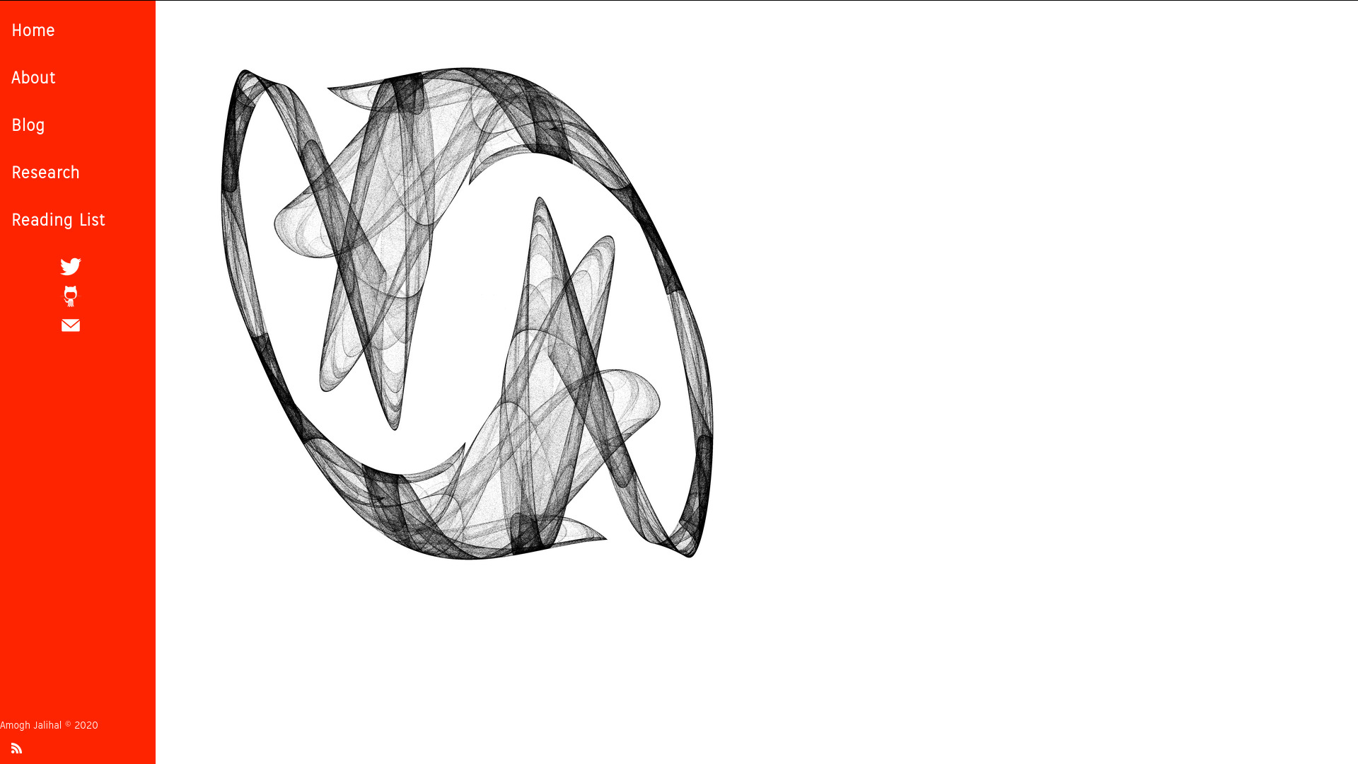
2019 - 2020 (June)
Another major color theme change.
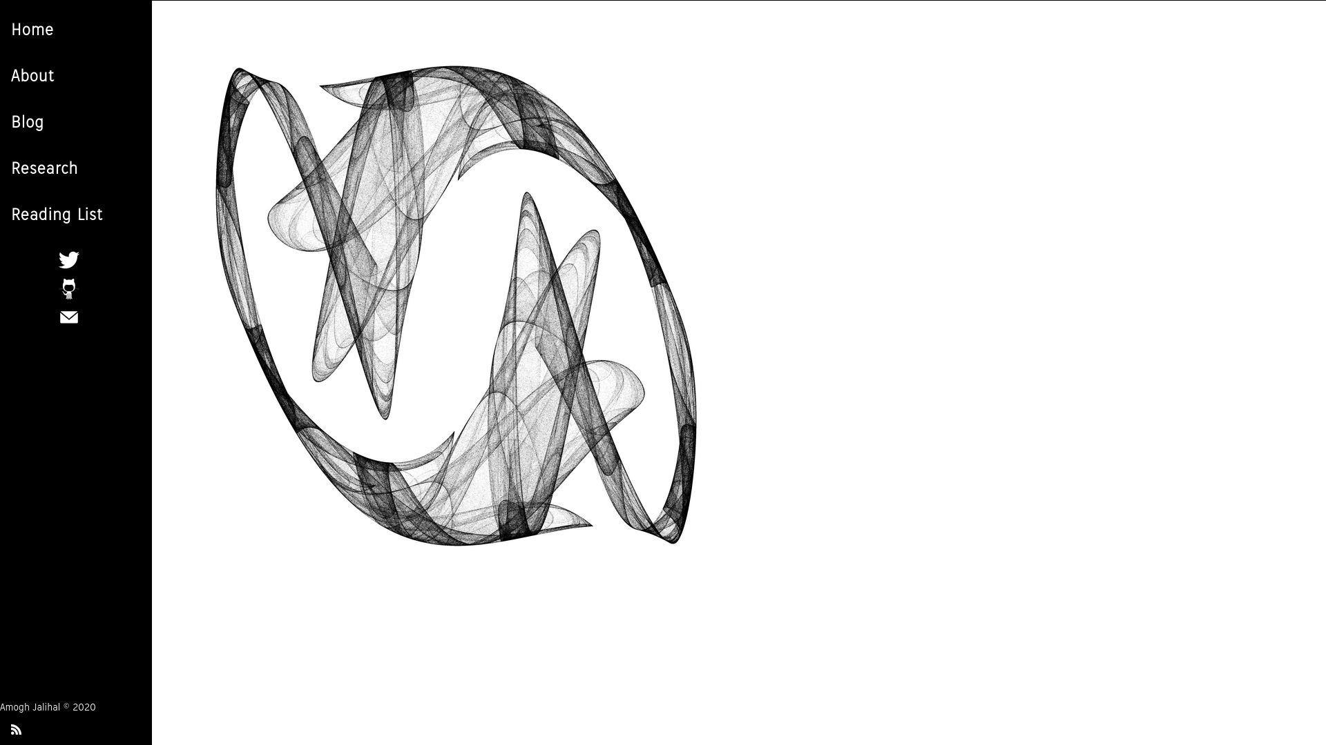
2020 June
In the middle of the quarantine and having defended my PhD, I
am back to twiddling with the appearance of this site. With the help
of @reckoner165, I’ve learned to use the browser to figure out how to
rapidly prototype webpages and slowly overcome my disdain fear of javascript.
The latest version has a collapsible sidebars, presenting navigation
on the left and a search bar on the right. Another major shift is that
I have now disabled Disqus on my website for a couple of reasons:
- Disqus seems to be extremely buggy. The comment box fails to load on half the pages, which makes it useless.
- For its buggy functionality, I learned that the disqus js code also seems quite bloated, loading on the order of 1 MB of data onto the page.
This seemed antithetical to my idea of a plain-HTML website, and I’ve removed the disqus js footer for now. I don’t have a replacement system for comments, but I might try using twitter as my interface to chat about my posts if anyone is interested.
