


Quantifying my pandemic year
TLDR; This post is a summary of an n=1 quantified self experiment I’ve been doing this year.
Background
Over the last few years, I have found some very interesting applications of orgmode’s customizable, extensible API, to better define my digital presence: implementations of ‘quantified self’ 1, a philosophy that encourages n=1 experiments to induce self awareness, and personal information/knowledge management (PIM/PKM) 2. Inspired by the former I have been using a series of org capture templates (an outdated version of my templates can be found here under Capture Templates) I have been recording my daily habits and workout statistics. The latter set of ideas is more diffuse, with no end goal other than curating “interesting” content and categorizing them in an easily searchable set of notes from online encounters. For this I have been using org-brain for a few years now, with a continuously evolving file structure. But more importantly, I maintain a personal diary.org for non work related daily documentation, and a labnotebook.org which serves as my digital lab notebook. In this post I’ve used a python API to org mode to chart out my year in quarantine.
Habits
What do I hope to achieve by doing a quantified self experiment? At different times, at most two distinct answers have formed in my mind:
- Can I improve my productivity by recognizing physiological markers leading up to a bad day?
- What interesting things can I learn about myself by building a little discipline around self tracking?
Spoiler alert: the first question is very hard to answer. The second is easier by virtue of it being so exploratory and open ended.
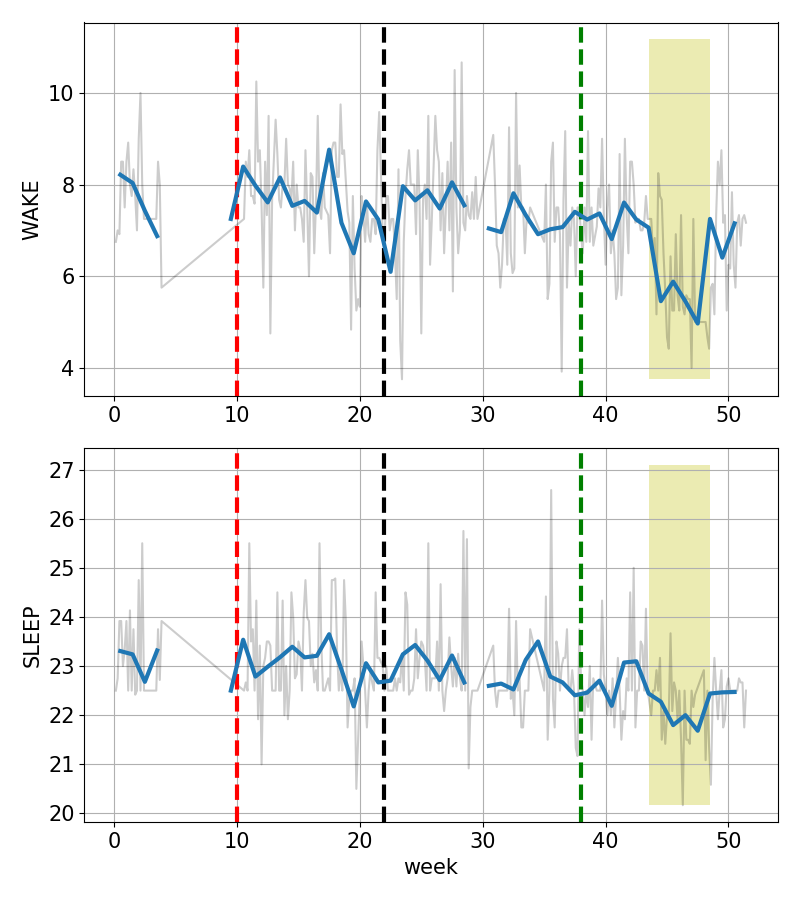
Sleep-wake times
I started doing this experiment in the beginning of the year, but quickly fell off at the end of January. The y-axis below is on a 24-hour clock. There are three vertical dashed lines corresponding to three major shifts in lifestyle this year:
- red corresponds to start of quarantine in Virginia, the 15th of March,
- black the day I defended my thesis, and
- green is approximately the week that I started going in to work every day to do experiments at my postdoc position.
The blue trend captures the weekly mean of the daily data shown in gray.
Two features stand out:
- My sleep schedule is more or less consistent, except for the increased variability post-defense.
- I moved to Boston in the middle of the pandemic, around week 30. My wake time trend appears to have shifted downwards since the move. The yellow patch marks the weeks when I did an active experiment in waking up early to maximize sunlight hours after daylight savings ended. (Need to get back to that routine!)
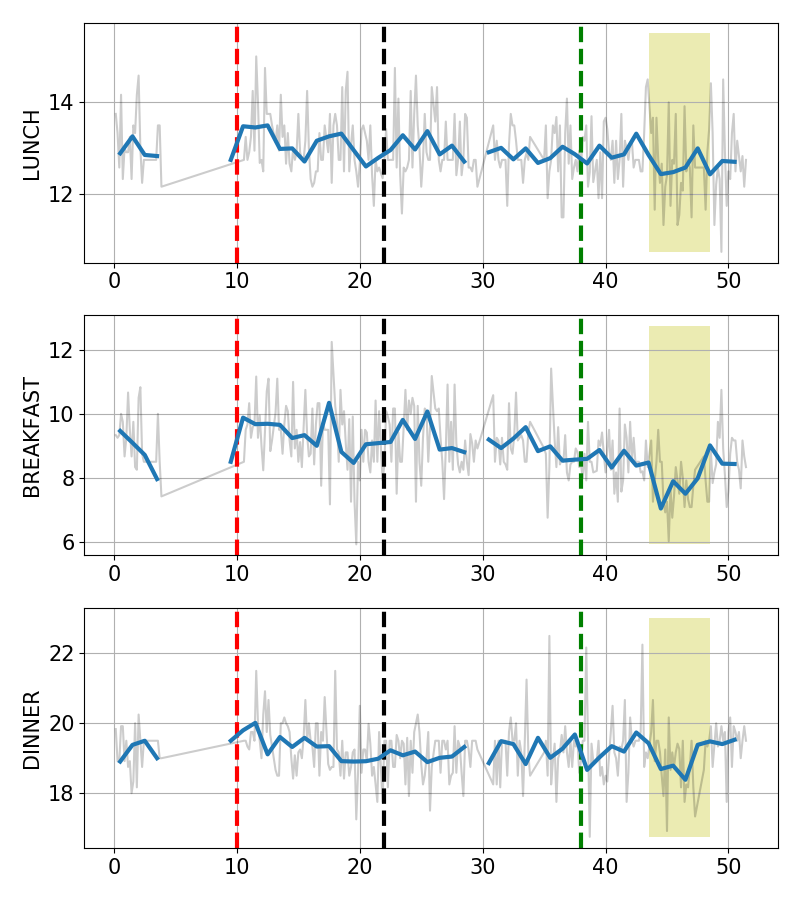
Food
Food! A feature of my routine pointed out to me earlier this year is my constant fear of where my next meal is coming from, not in an economic sense but a literal “what do I eat for my next meal” sense.
I love how my breakfast times have become less variable since my move to Boston, but it is even more amusing to see the mean of my lunch times being nearly flat, even after my schedule shifted to waking up earlier! (I wonder if this is a remnant of my school lunch time?). Finally, I thought I had started eating dinner earlier and earlier, but this plot shows that my dinner times have been very constant at least since the pandemic hit!
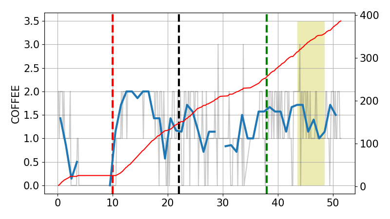
Coffee!
I have dug a reputation for myself for being an amateur coffee snob. I’ve been tracking the number of cups of coffee I drink. This doesn’t necessarily reflect the amount of caffeine intake, because a ‘cup’ can be either an espresso shot or a tall mocha. Interestingly, it looks like I don’t drink more than two coffees a day. In fact my mean coffee consumption seems to have dropped from 2 to about 1.5 since the early pandemic. To put that in perspective, that’s close to 400 cups of coffee this year.
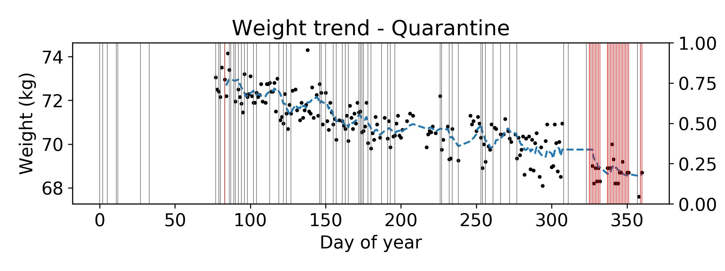
Workout
One happy development during the pandemic was that I started running fairly regularly. I tracked my weight every day to see the variability on days that I didn’t run. I also started doing a 6.8 mile round trip bike commute since September which I started tracking more recently. A vertical line corresponds to a day that I went running, and a red line corresponds to a day that I commuted to work.
The trend is really striking. The days I stopped running show an immediate flattening in the weight trend! Also, though the commute to work gets me some fresh air, it unfortunately doesn’t seem to be a good replacement to running :(. Good to know…
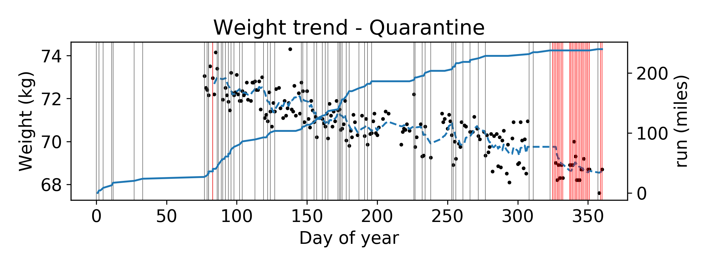
Here are two more trends that I found really interesting. Cumulative number of miles run this year…
… and cumulative number of miles biked since I started tracking my commutes.
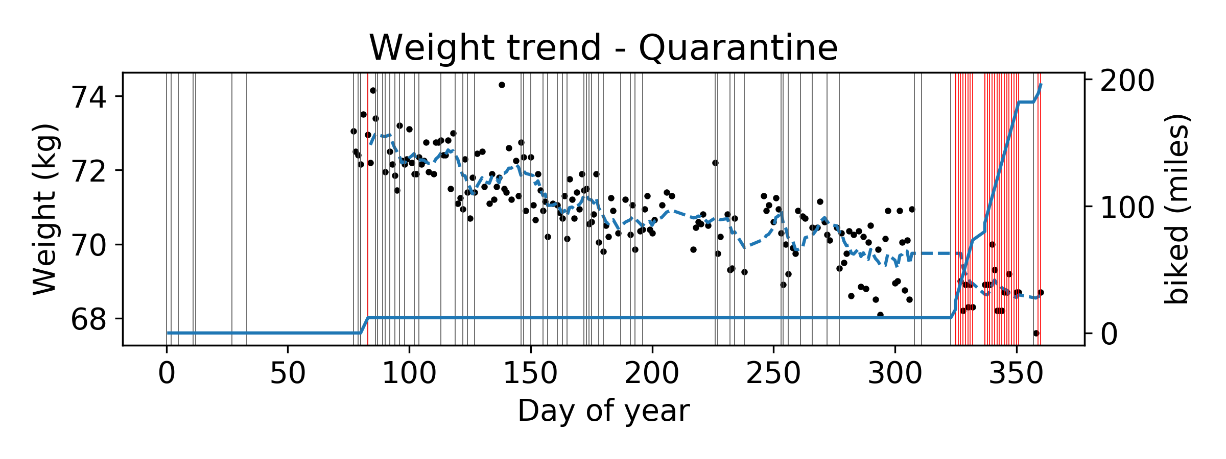
200 miles run this year seems quite impressive to me! I saw on twitter that one challenge is to run a 1000 miles in a year. While that seems out of reach right now, I’d definitely like to try and hit 500 miles in 2021!
Recording state
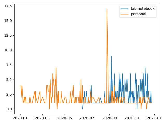
I don’t actively journal every day. I have tried, and on the few times I sit down to write a long form journal entry, I am not sure if it has helped me. Recording my mental state remains a challenge. However recording events is straightforward in orgmode thanks to capture. Inspired by Karl Voit’s question “what were you doing on February 14th 2007”, I have pivoted instead to trying and making an entry of the thing I am doing right now, and I let orgmodes Agenda remind me of what I was doing at some point in history. This coupled with my custom time tracking pipeline is intended to slow me down and help reflect on the successes and failures of the week. While this remains a work in progress, I can at least share some summary statistics (using the wonderful org-parse) of what a typical day looks like for me.
The goal is to get a crude estimate of productivity. The two trends below correspond to two “date trees” in the two distinct org files that I maintain, one a lab notebook and the other a personal “diary” file. The spike in September aside (when I refiled a bunch of expired TODO items), I am moderately satisfied with the state of my note taking right now. An average day at work seems to have between 2 and 5 entries. One goal of mine is to get better at estimating effort, which should be more straight forward now that I am getting used to doing experiments in the lab.
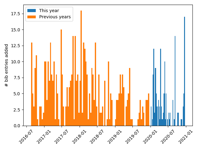
Another, indirect measure of productivity is how much I explored the literature. Here is a time line of the entries I added to my global references.bib file. Unsurprisingly, reading and note taking for scientific literature took a hit in the pandemic. Need to get those numbers up next year!
Entries in my external brain
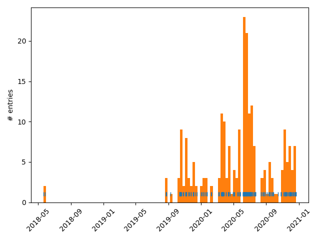
Finally, a series of tools have popped up in recent years that (re?) implement notions of an “external brain”, a customizable personal wiki, or knowledge repository that can help augment our traversal through information landscapes on the internet. Some of them, with orgmode interfaces include org-zettlekasten, org-roam, and org-brain. I played around with org-brain about two years, forgot about it for a period, and then started using it rigorously last year. Below is a summary of the number of entries I’ve made over the last two years. I’m happy with my readings over the pandemic!
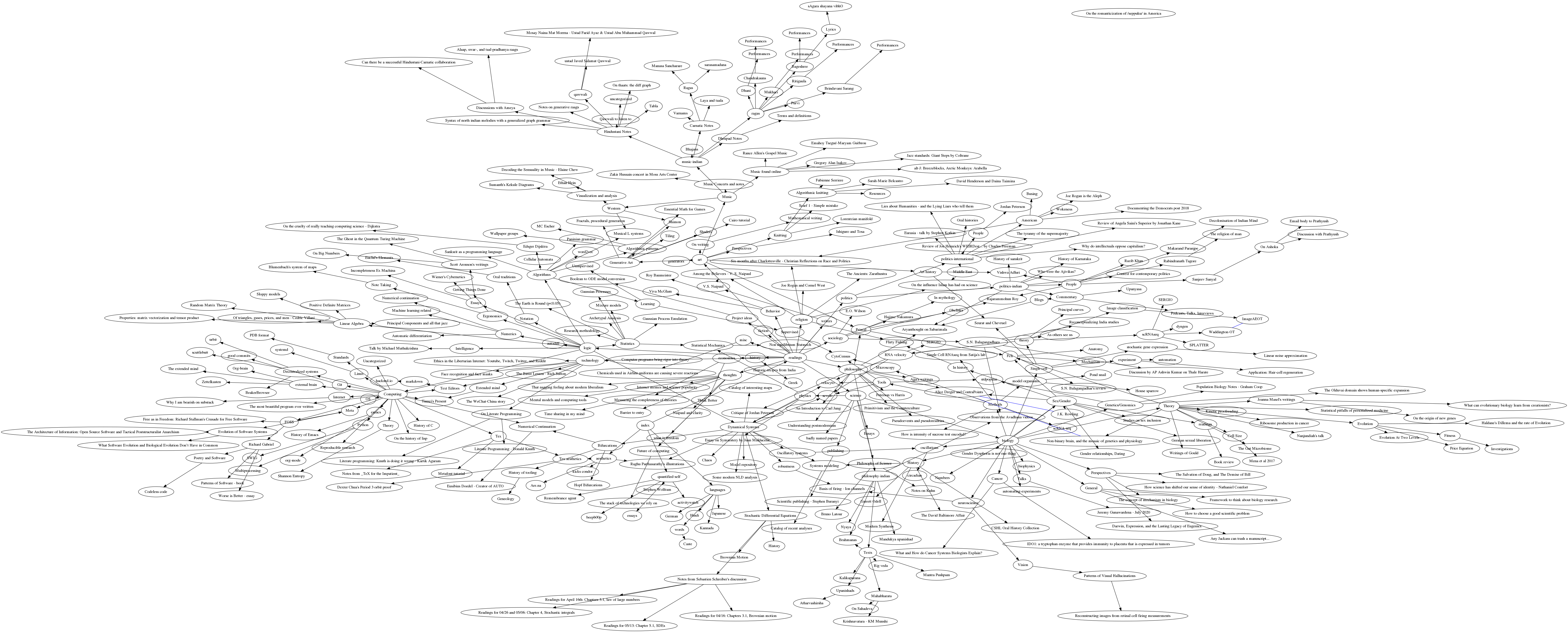
A goal for next year is to get an export of my org-brain to play nicely with the rest of my website. In the mean time, enjoy a snapshot of my org-brain! (Click on the image to see the whole thing.)
Fin
- In a year when I defended, spent three uncertain months without pay before moving and starting a postdoc during a global pandemic, quantitative habit data collected can at worst serve as a null trend to compare against in future years.
- My physiological habits, during a year with no cross-timezone travel are actually quite stable! Now I’d like to compare this with others to see what the typicaly variability for sleep-wake times is during a week.
- If notetaking is anything to go by, I’ve been reading quite a bit (of non-science) lately!
- I seem to have all the infrastructure I need to automagically record habits and productivity quantiatively. I’d like to continue this experiment as long as I can next
I’d love to hear your thoughts on this experiments! Happy new year!
Footnotes
1 See alphapapa’s post
2 Karl Voit uses org mode extensively/exclusively, while @karlicoss’s Promnesia integrates data sources including orgmode notes to create annotations in the browser.